CLIENT: Measured Strategies
BRIEF:
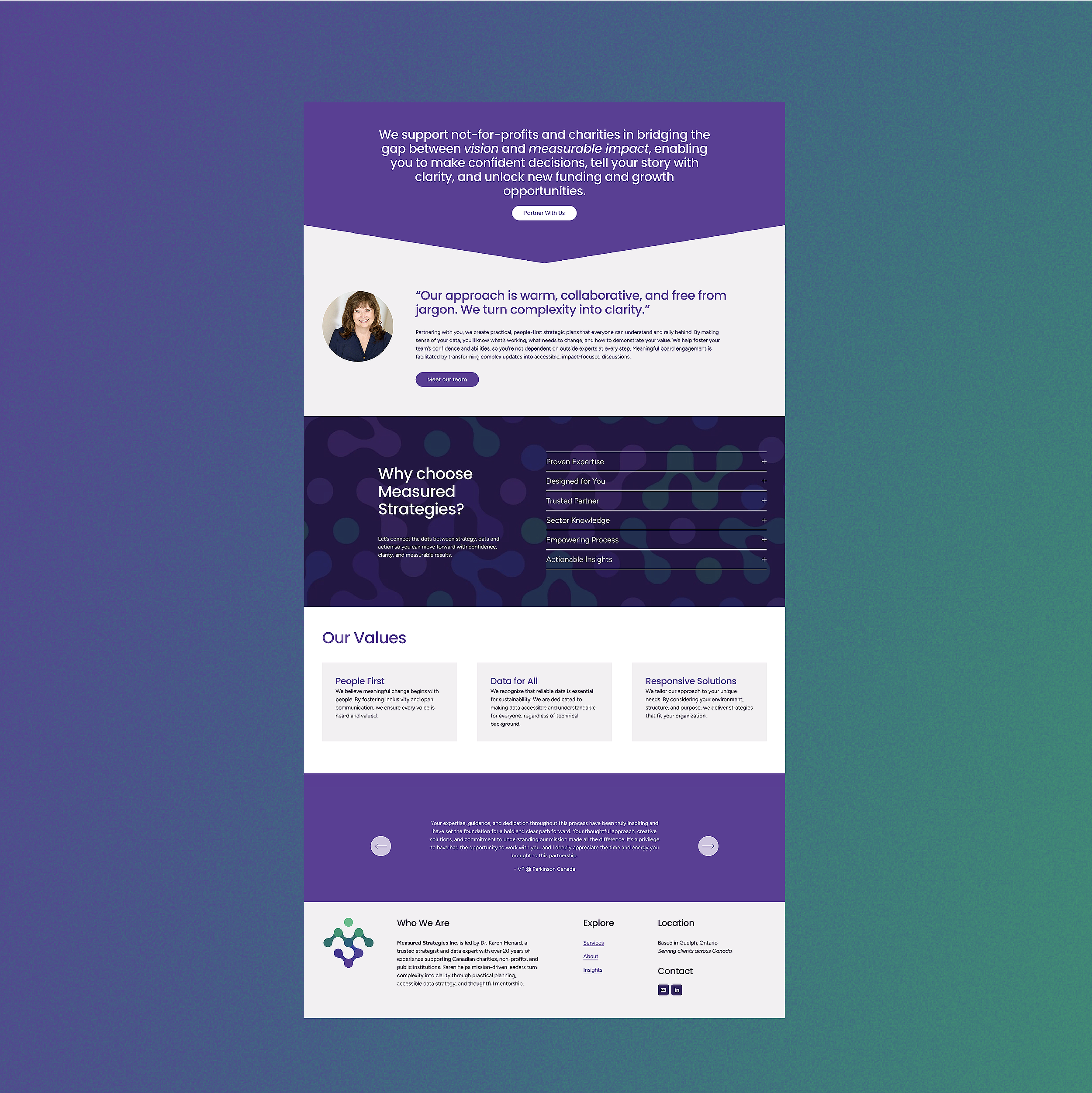
Measured Strategies is a trusted strategic partner for nonprofits and charities, helping mission-driven organizations bridge the gap between vision and measurable impact. With a foundation in both strategic planning and data expertise, Measured Strategies offers a seamless, human-centered approach to solving complex problems.
Led by a social psychologist with a deep love for research, discovery, and real-world impact, Measured Strategies marries data with empathy. The brand specializes in uncovering patterns, connecting the dots, and turning dense information into clear, effective strategies that drive meaningful results. Clients don’t just receive consulting—they gain a collaborative partner who cares deeply about their goals, adapts to their needs, and brings warmth and clarity to the process.
Measured Strategies was seaking a logo and website that would visually reflect these important pillars that set the foundation for the brand.
SERVICES:
Logo Design, Website Design and Stationary
ABOUT THE DESIGN
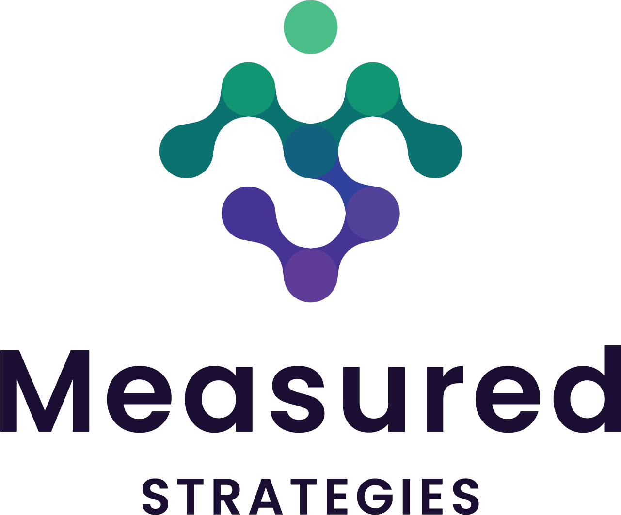
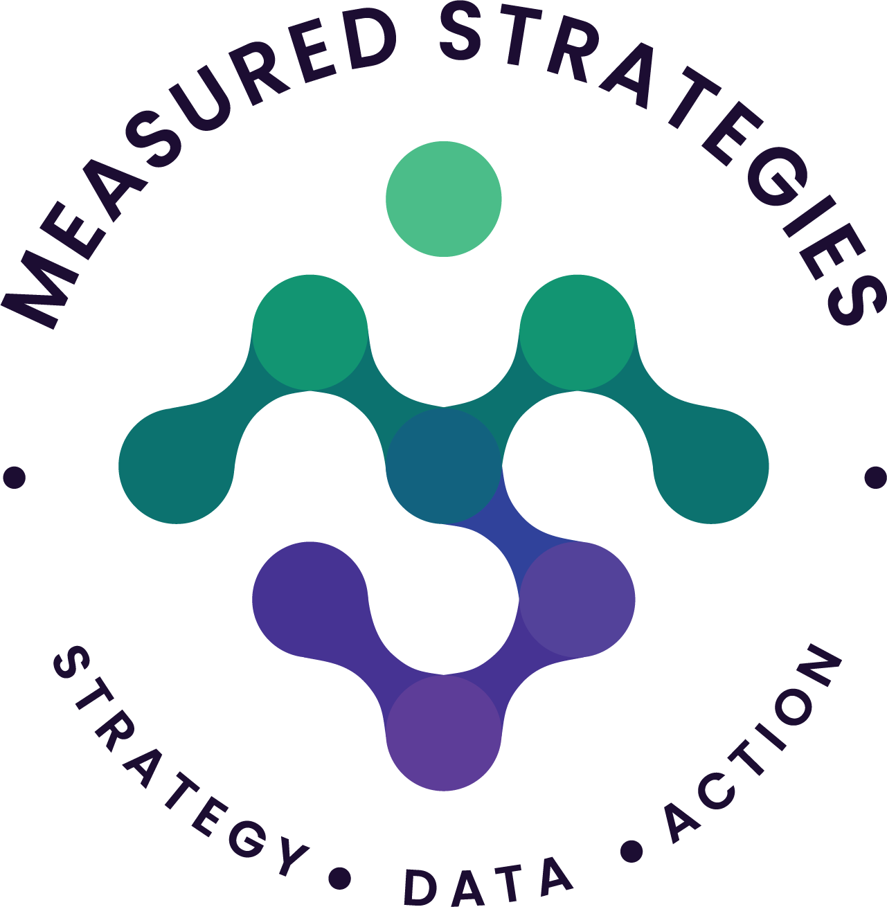
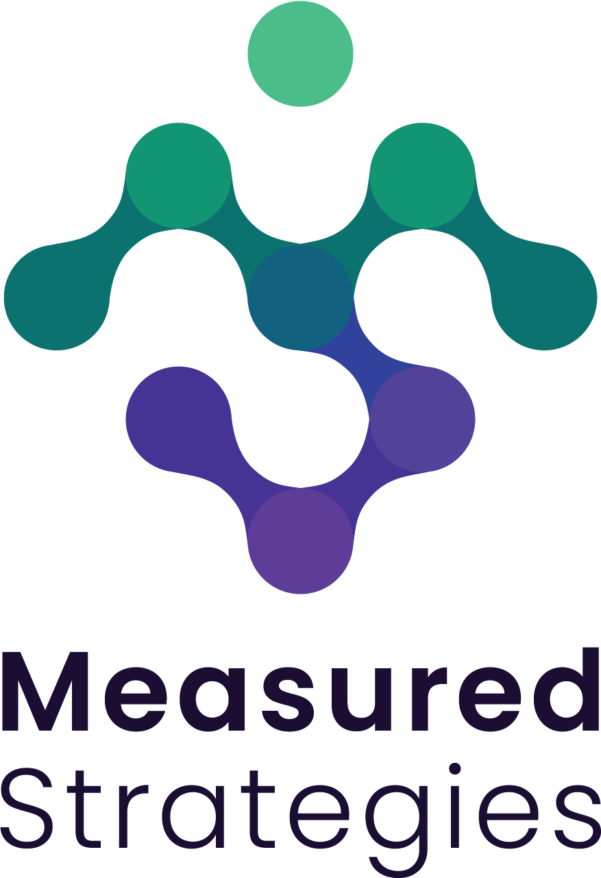
The logo is more than just a visual identity—it’s a layered symbol that represents the Measured Strategies brand and communicates their values. It brings together powerful elements that reflect the heart of our approach: clarity, transformation, connection, and a people-first philosophy.
🔹 Upward Arrow: A stylized “M” that doubles as an arrow, symbolizing progress, momentum, and forward thinking. Representing the transformative journey from data to impact—always aiming upward toward meaningful impact.
🔹 Connecting the Dots: The integration of “M” and “S” reflects how strategy, data, and action come together to create clarity and impact. Much like data points forming a larger picture, Measured Strategies weave complex insights into strategic action.
🔹 Puzzle Piece: The modular nature of the design with it’s use of negative space conveys collaboration and the power of uniting diverse perspectives. Every piece matters and thoughtful collaboration unlocks powerful solutions.
🔹 Human Form: The overall shape subtly mimics the human form. It reflects the people-first-philosophy of the brand and counteracts the perception that strategy and data is unapproachable and impersonal.